Restless Development
As a genuinely youth-led charity, Restless Development has a strong visual style, which reflects its youthful energy and dynamism. On both long and short copy pieces, our job was to maximise the impact of this visual identity while also engaging readers on an emotional level. This involved working closely with our writers to get the messaging and tone exactly right.
What we did
Design, copy and print
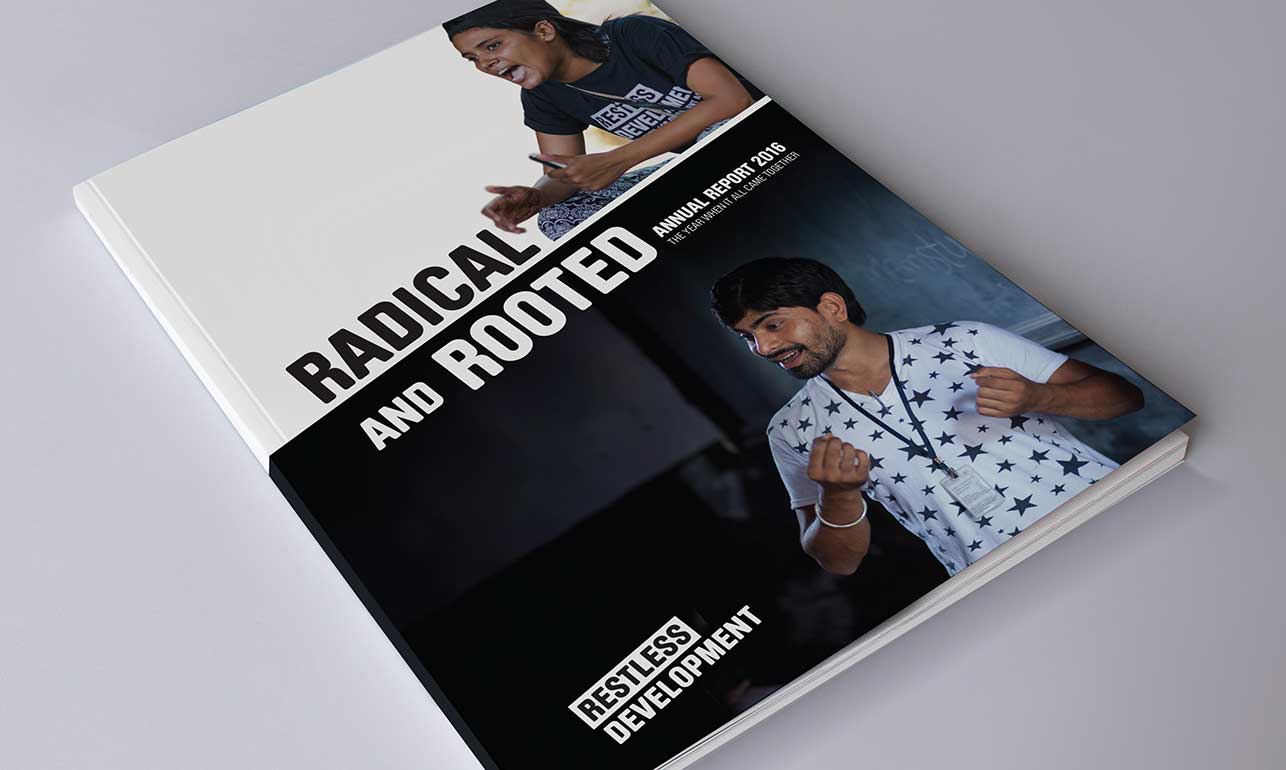
Annual report
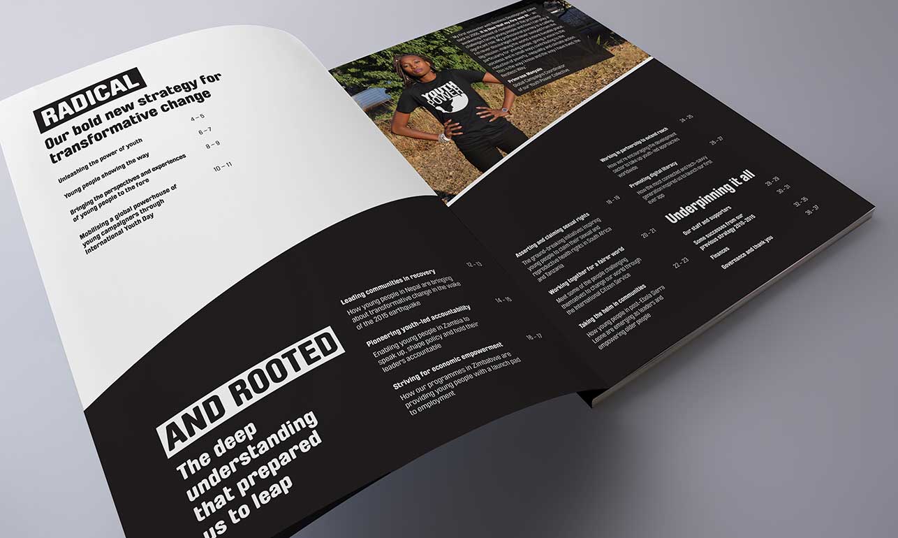
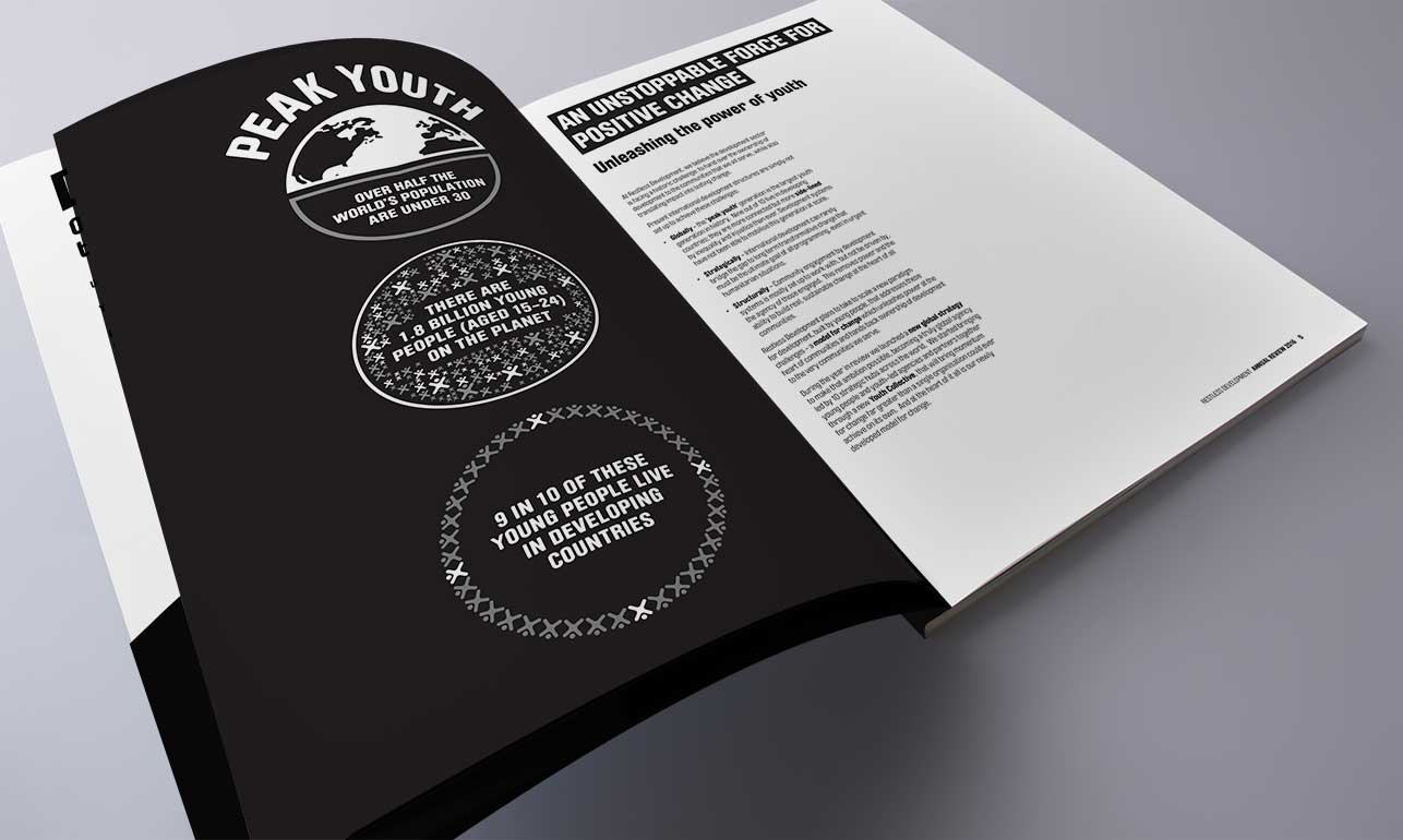
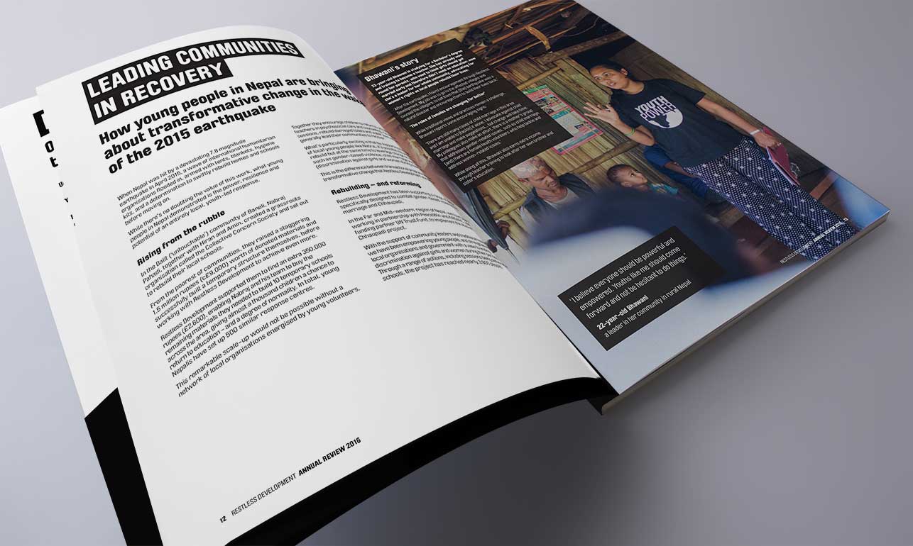
For this annual report, the client wanted to achieve two apparently conflicting aims; to highlight their exciting new strategy while at the same time including a LOT of information about previous and ongoing projects. Working with our writing partner, Lisa Pember, we came up with the idea of ‘Radical but rooted’; the exciting and ‘new’ thoroughly supported by the tried-and-tested. We then reinforced this structure with a feature index, used smart black and white infographics to clearly communicate the new strategy, and chose lots of bright and engaging photography to bring the supporting evidence to life.

Media insert
For their first ever media insert, the team at Restless Development was keen to stay true to their strong graphic style in contrast to more traditional needs-based approaches. However, with low brand awareness, we knew that immediacy was integral to cut-through. Hence we stripped everything back to the ultra simple with a 3-word headline that quickly welcomed the reader to opt in.


